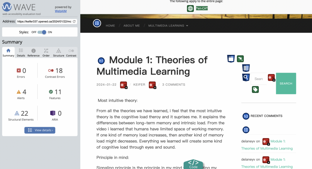
Accessibility with WAVE
After inserting my first post URL into WAVE, I found that WAVE pointed out many of my shortcomings regarding accessibility. For example, my font color lacks contrast, and alternative text is missing in many places. I was surprised by the number of questions like this that I wasn’t aware of before. Changes to the above issues have made my blog more accessible, this also allows my posts to be seen by more people.
Text to Speech/Screen Readers:
I read my first post using a text-to-speech tool. During this period, I tried closing my eyes and listening to feel the difference. I’ve found that while text-to-speech is a great tool for helping people with dyslexia, it’s not entirely perfect. Because the reading voice is more robotic and lacks inflection and tone. And it cannot filter and distinguish article topics and annotation symbols. This makes reading more difficult.
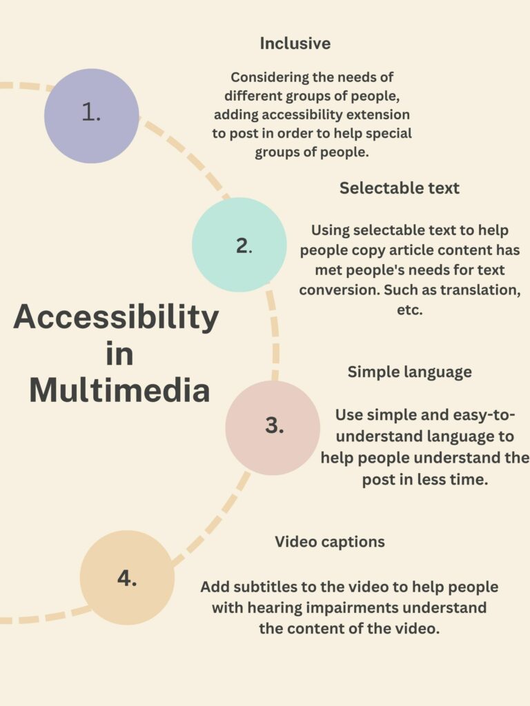
Infographics with Canva:
Comments on other’s post:
Hi, I believe you summarized it excellently! You’ve acknowledged your limitations and reflected on the deficiencies in the Module 1 video. I truly hope you’ll produce superior content in the future! Regarding the poster you created using Canva, I find it very straightforward and comprehensible. The layout is simple, making it easy to grasp your message at a glance.
Hi Keifer,
Thank you for another insightful blog post! I’ve enjoyed reading your reflections. I really resonated with your comment regarding how Text to Speech (TTS) programs can have issues with tone and inflection as this was something I also encountered when I used these programs for translation purposes when living overseas. I’m hopeful that, one day, TTS programs will be able to effectively detect tone and inflection, do you think that this will be the case?
I also think that your infographic very effectively lays out various media accessibility components in a way that is nicely spaced and minimizes cognitive overload!
Great work and take care,
Sam Montague
Hi Keifer,
I really enjoyed your Module 2 post! I too found many similarities with my WAVE accessibility report, especially in regard to the contrast of text. I also appreciated your insight on the text to speech tool. In the past, I have used text to speech on applications that allowed me to change the voice preferences, which I feel helped with my comprehension. I love that you took into consideration how people of various abilities may use this tool to their advantage and what that might look like. Do you think that the use of this tool might be more beneficial if it is in combination with reading as well? If so, how do you think we can still make this dual approach accessible for those who are visually impaired?